
UI Conventions*
The most important principle of our interface is consistency. If this page does not document how something that you'd like to do should be done, search through the codebase to find how someone else did it.
The second principle is intuitivity. All interactions should be non-punishing. This means that actions such as deleting a unit, exiting the game, and sharing private data should never happen without the user's explicit confirmation.
Finally, our interface must have usability. Buttons should be placed near what they affect, UI groupings should make sense, and names must be non-technical.
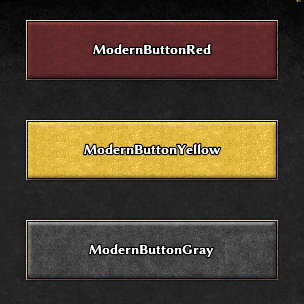
Button Design
There are three primary button styles: red, yellow, and gray.

Red: Used for the 'recommended' action. Tells the user how to continue forward. Examples: Start Game, Join Game, Okay, Send.
Yellow: Used over red in cases requiring special emphasis.
Gray: Used for actions not core to the normal flow of actions. Examples: Back, Cancel, More Options.
*This page only documents how elements from the 'modern' stylesheets work. All other styles (besides per-page ones) are deprecated.
Attachments (1)
- modern-button-types.png (90.5 KB ) - added by 8 years ago.
Download all attachments as: .zip