
#2894 closed defect (fixed)
[PATCH] Display of general options
| Reported by: | mimo | Owned by: | mimo |
|---|---|---|---|
| Priority: | Nice to Have | Milestone: | Alpha 19 |
| Component: | UI & Simulation | Keywords: | simple patch |
| Cc: | Patch: |
Description
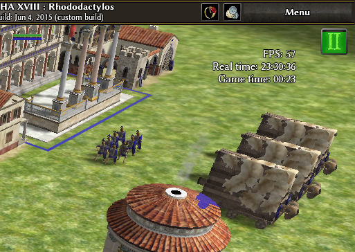
In the option menu, we can now display the FPS, the real time and the ingame time which are displayed in the upper-right corner. But
- displaying all of them looks quite weird because the appearance of the ingame time is completely different from the other two
- the real time is displayed just at the position of the research progress and hides it because it has z=199
It would be nice to uniformize the appearance of these displays, and find a way to avoid the hiding of research progress, either by putting the research progress to a bigger z, or moving these optional displays to the lower-right corner. In addition, their position could depend on the number of enabled option in order to avoid a big hole when enabling only the first and third ones.
Attachments (11)
Change History (18)
comment:1 by , 10 years ago
comment:2 by , 10 years ago
Wherever they go, they need to be consistently formatted.
Replying to mimo:
In addition, their position could depend on the number of enabled option in order to avoid a big hole when enabling only the first and third ones.
One possibility would be to construct a string with each of the data as needed, separated by newlines or something, and display them in a single text box.
by , 9 years ago
| Attachment: | dataCounters.png added |
|---|
comment:3 by , 9 years ago
I have tried put counters in different corners, but best place is top right (f.e. right bottom place intersects with elements in the main menu and is more harder to look).

comment:4 by , 9 years ago
| Keywords: | review patch added |
|---|---|
| Summary: | Display of general options → [PATCH] Display of general options |
by , 9 years ago
| Attachment: | data_counters.patch added |
|---|
by , 9 years ago
| Attachment: | dataCounters_v2.png added |
|---|
by , 9 years ago
| Attachment: | dataCounters_v2_ceasefire.png added |
|---|
by , 9 years ago
| Attachment: | dataCounters_v2.1.png added |
|---|
comment:5 by , 9 years ago
Thanks for working on this patch. Here are some comments after testing it: On some backgrounds, the time counters can be difficult to read. May-be you could add a background color, or change the color of the text. When the number of digits of the FPS changes, the position of the "FPS" text changes. That gives a weird effect when your FPS oscilates for exemple between 9 and 10. I find strange to have the time counters at this place when no techs are researched (which is still the main part of a game). May-be it would be better to push the time counters on the right, and that the vertical position of the researching techs will adapt itself to be displayed a bit below these counters. But that's only my personnal taste, may-be ask some other opinions on IRC before changing that.
by , 9 years ago
| Attachment: | dataCounters_v3a.png added |
|---|
by , 9 years ago
| Attachment: | dataCounters_v3b.png added |
|---|
by , 9 years ago
| Attachment: | dataCounters_v3.1.png added |
|---|
by , 9 years ago
| Attachment: | data_counters_v3.1.patch added |
|---|
comment:7 by , 9 years ago
| Keywords: | review removed |
|---|---|
| Milestone: | Backlog → Alpha 19 |
Thanks for the patch.
I agree that they shouldn't block research progress (sorry, I wrote the Real-time overlay). Could research progress perhaps spawn from the bottom instead of the top?